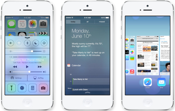
Apple Shakes Up iOS with Redesign

iOS, the heart and soul of Apple’s wildly popular iPhone and iPad, has looked basically the same since the phone first launched six years ago. We’ve been yearning for a change. Now we finally have one, and we couldn’t be more excited.
Meet iOS 7. We’re happy to see the departure of glossy icons and “skeuomorphic” textures (think the yellow lined paper in the Notes app or the green-felt table in Game Center). These designs seem dated and look bloated in comparison with the sleek hardware design of modern iOS devices. The new version uses “flat” graphics and thinner typefaces, making for a more streamlined look. We also love the bright new colors and the increased use of white. Simplicity and friendliness is a winning combination in our book, and iOS 7 nails it.
The new iOS looks flat, but it also utilizes depth. Translucent panels slide over your screen, giving the impression that multiple flat layers are sitting on top of one another. The display even changes as you move your device to create depth effects. We were concerned that a flatter iOS might end up looking like a knock-off of Microsoft’s new tile-based “Metro” design, but this layered style looks unique and adds a feeling of orientation within the various screens. Cool!
And, of course, big changes to iOS mean big changes to its ecosystem of apps. We think developers will need to match Apple’s refined functionality and ease of use in addition to its new aesthetic. That may be a liability for some, but we see this as an incredible opportunity for creativity. Utility apps as well as games could use the new layered style to change the ways we interact with content.
The bottom line: iOS 7 looks like a beautiful and modern refresh of the popular mobile operating system. It seems familiar yet new, stylish yet unique. And it holds promising opportunities for innovation from app developers. Great job, Apple; we can’t wait to get our hands on it this fall!
